Our Goal
How to?
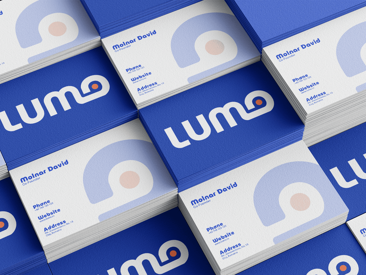
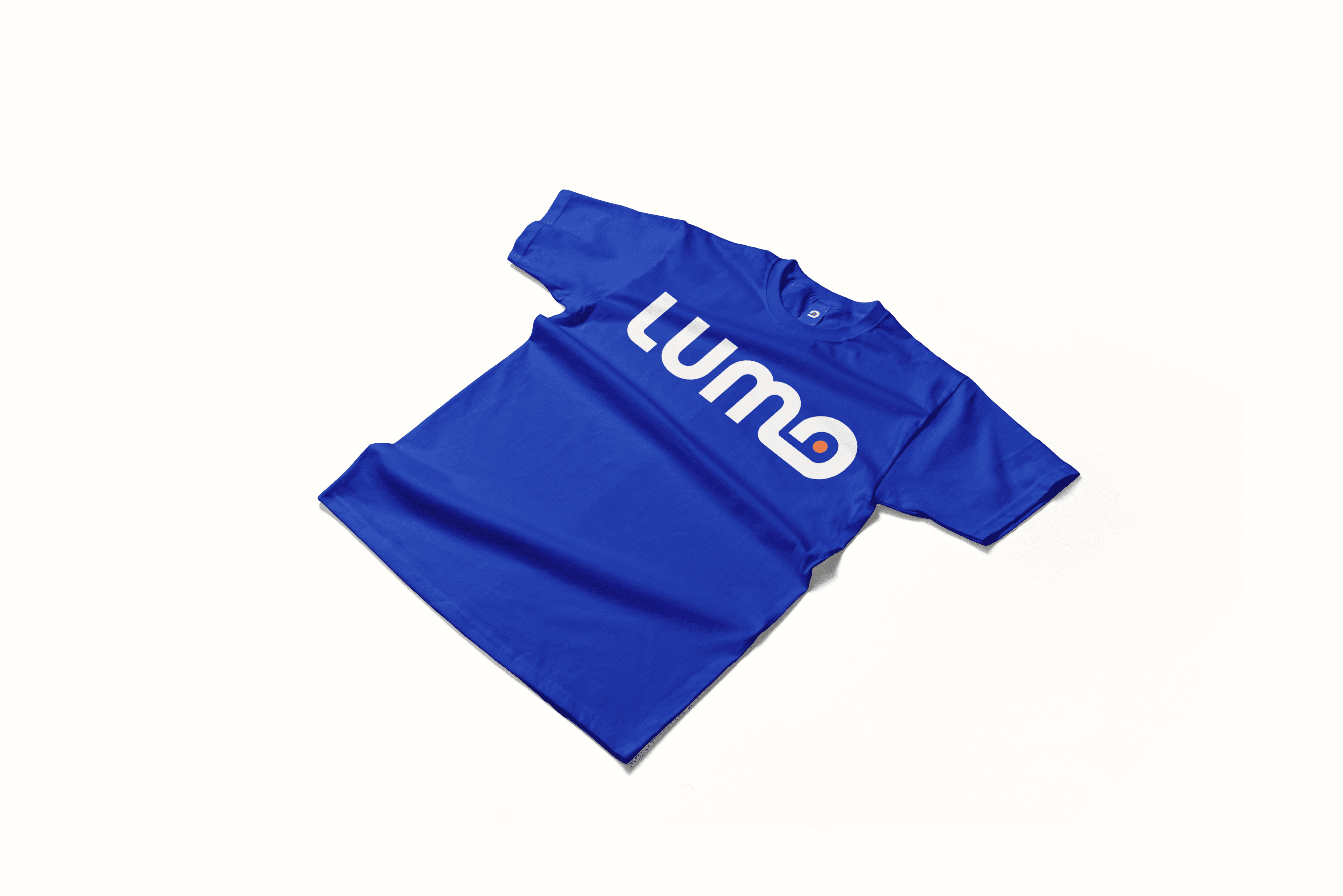
The challenge? A design that speaks precision without overcomplicating things. Every element in LUMO’s identity was built with intent—structured forms, balanced proportions, and a visual rhythm that feels both dynamic and controlled. The wordmark delivers impact without excess, while the icon distills the brand’s essence into a mark that’s sharp, versatile, and instantly recognizable.


Font & Color Selection
A brand built for precision needs a type system that delivers the same. Neue Machina was the perfect choice—industrial, sharp, and unapologetically bold. The mechanical details and geometric forms bring a technical edge, reinforcing LUMO’s no-nonsense approach to performance.
The color palette? Straight to the point. Every shade was picked with purpose—high contrast for clarity, deep tones for authority, and a balance that keeps the brand looking sharp across all applications. No fluff, no excess. Just a visual system that works as hard as the professionals using it.